My Technical Blog Post
Hello Everyone! I've finally put together my Technical blog post after messing around with my CSS longer than I probably should have.
Here are the 3 websites that I choose to review.

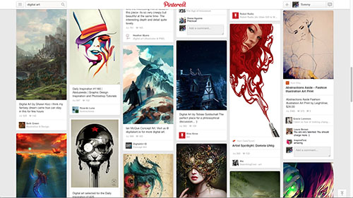
Finding things that I love on the internet can be a daunting task some times. Pinterest allows me to really dive into a subject and find very neat things really fast. I like that I can follow other people that have similar tastes and likes as I do.
Pinterest is unique in that it doesn't have one colorful or large element that stands out. Each item is given equal billing. The sea of pins on the page very so much that the whole can almost be considered art at times. You have to stand back to see it, but the many pins acting together can be a beautiful thing.
Visually, Pinterest is seamless, colorful, rich, overwhelming, attractive. It's content and purpose is Organized, Visual, Fun, Consuming, Educational. The content being visually pleasing really draws you in and makes you want to stay.
Pinterest solves a couple of things. It allows users the ability to organize and remember things of interest. I can't tell you how many times I've found something neat on the internet only to forget about how to find it a month later. Pinning things I like to Pinterest ensures that I always have easy access to them.
Pinterest also solves the problem of finding neat things on the internet that pertain to me. Searching blogs, pictures, video, websites, etc. on the internet can be daunting when using a search engine like google. Pinterest allows a very visual interaction to searching that I think will eventually kill the normal way we interact with data via a search engine.
The navigation of the site is very simple as the page infinitely scrolls. Search once and scroll to your hearts content. The main menu sticks to the top of the window making it very easy to search for new content with out scrolling back up.
Pinterest also provides pre-defined searches such as "Everything" and "Popular" that allows for easily finding new things when you don't know what you really want.
For most of my visits I feel happy and stimulated but I do have to admit that it's very easy to follow the rabbit down the rabbit hole and end up feeling like you've wasted time if you stay to long.
Pinterest does not sell anything at this time but there is talk of promoting pins to the top of search results by paying in the near future. There is also potential for targeted advertising if Pinterest was to ever allow ads.
Noah Bradley

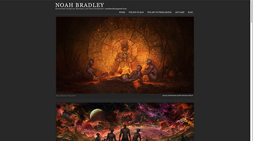
I love digital painting. Photoshop has opened up a world to artists to create some pretty amazing things. This website is for one of my favorite artists, Noah Bradley. I love Noah's art work and I visit his page often to catch updates, new artwork, and blog posts.
Noah's home page is dominated by the art work that he posts. Your eye goes directly to the first piece of artwork on the top of the page. Standing back and looking again shows more of an emphasis on the dark grey negative space. The darkness makes the art work pop.
Noah's page is beautiful, awe-inspiring, colorful, dark, and simple. His purpose is to tell a story, share his art work, provide inspiration, and show that art can be fun.
His site doesn't solve any problems other than his desire to share his work with the world. In that regard it succeeds in every way.
The site is very simplistic and lends itself to easy navigation because of it. Links are easily found and are organized well.
The site is responsive and can be quickly navigated with little issue. All of the main content resides on the home page and only requires scrolling. Links at the top lead to other websites to fulfill other needs for the artist.
Noah's page leaves me inspired. I love art and wish I was as good as this guy. Visiting Noah's site always gives me a pick me up and the desire to push through hard things. If he can create things like he does then I can do.
Noah does sell prints of his artwork through another site that is linked from his page. I have been tempted a few times to purchase his art work but have not as of yet. If I do purchase anything It will most likely be his training course.
Engadget

I'm a computer geek. I love technology and all the new stuff that changes with it over time. I look at Engadget daily to stay up with the latest tech.
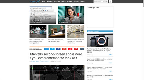
My eye is initially drawn to the top stories section at the top of the home page. This is a quick reference to the stories being read and commented on the most.
Standing back, I tend to see the first story below the top stories section because it’s image is much larger than the collection of smaller images that is the top stories.
Visually, Engadget is bright, clean, well organized, slim, and boxy. It's purpose and content are fun, focused, informative, interesting, and educational.
The site gives you a window into new technologies, reviews on tech you might want to buy, and news on upcoming technology that will make a splash. It's rgreat geek news!
Finding new content is straight forward as new stories appear chronologically on the home page. There is also a quick search bar where you can search for stories by keyword that makes finding specific news very easy.
Engadget also provides a static menu at the top of the page that allows browsing of all their content very simply. Click on the category you wish to browse and away you go.
That's the nice thing about Engadget. It doesn't take much time each day to browse the recent stories. With little effort, I stay informed on the latest tech.
The site does not sell anything but does advertise electronics and software. I have never clicked on any of the ads and I don't find them to be overly intrusive.
