

Week 8 - Blog Redesign

The Challenge
I'm in the final stretch for my phase 0 prep work for DBC. These last two weeks are all about review and we have some freedom to choose what we work on. One of those options was to update the design of our personal github.io websites that we use to blog.
I've been pretty satisfied with my layout but there have been some things bothering me about the design since I got it up and running back in week 2. That seems forever ago now. Here is the list of things that were bothering me and what I did to address them.
- Color Scheme to Dark
- Gradient Color Backgrounds made some text hard to read
- Blog posts not easily accessed from central location
- Font for general text to small and spacing to close
- List items poorly spaced and formatted with no bullets
- Background not fun enough
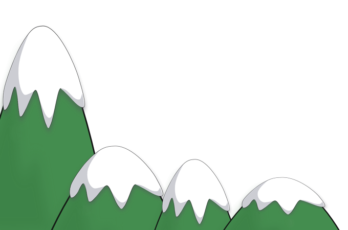
Color Scheme to Dark
From the get go I felt the background color was to dark for idea of a mountain scene that I wanted to depict. I attempted some changes but ran out of time back in week 2. This time around I was sure to go much lighter with not only the background but also the background color of the nav bar, main section, and footer elements. The lighter color really makes reading text much easier on the eyes and provides a much more pleasant reading experience.
Gradient Color Backgrounds Distracting
The gradients for backgrounds was a cool idea but it was distracting and made it hard to read some text depending on its location. The main background still retains it's gradient but it is much more subtle and gives the impression of the sky.
The gradient for the nav bar, main section, and footer were removed all together. The solid lighter color looks much more pleasing and makes reading text simple.
Blog posts not organized and easily accessed
The more we get into DBC the more I started to realize that the blog posts are the main point of our github.io websites. It's here that we want to show off what we are learning as well as our ability to contribute to the tech community at large. Because of this I wanted my website to really be about my blog posts.
I moved the posts all to their own directory and then provided a main page where you can scroll through my posts by date. Each preview on this page is just a small excerpt from the larger post and allows for quick access to the full post.
I also left the blog posts linked in my unit directory for phase 0 that I now moved under the DBC link. This makes for a cleaner approach and works well I think.
Rethinking Font Size and Spacing
My Font size and spacing was driving me nuts! I looked at other peoples blogs and started to notice that their font sizes where much larger and had a greater spacing between lines. After some research and some playing I finally came to a font, font size, and font spacing that I think really makes for an easy read.
Hats off to Whitney O'Banner and her blog for giving me the inspiration for getting my fonts right!
List items poorly formatted
My CSS for unordered list items was horrid! The padding and margins made lists indent way to far. I also hated that I had no bullet icons for each item in the list. Since I love lists, I had to take the time to fix this!
I knocked back the padding and margin and then followed up by using FontAwesome to add some checks as bullets. I also decreased the font size on unordered lists so that they stand out a bit more. The end result turned out great.
Back ground needs to be fun!
Not that the mountains weren't fun but I wanted to add some clouds and a sun. Once I did that I had to make them move!
I dug into jQuery and found the animation method that allows for moving HTML elements around the page and I was soon having fun. A word of caution! Memory leaks through JavaScript are real and I had one that I had to solve from implementing my animations. Making sure to end each animation before starting the next solved the problem and the end result is pretty cool. Take a look at my.js files if you want to see how I get things moving.
Feedback
Next I sent my redesign over to Matt Chan to get some feedback. It's always nice to have some ideas as to what is working and what is nice. Matt was nice enough to point out that my landing page was a bit much with my twitter feed and about me all crammed together into a single page.
He showed me some examples of simple and clean landing pages that really looked nice so I decided to opt for simple vs crazy. I removed the nav bar, main section, and footer elements all together and simply spelled out my name, centered it in the middle of my mountain scene and added a couple of links below it. The effect is pretty cool and I have to thank Matt for the idea.
Conclusion
A much needed revamp and a more professional and fun website as a result. The process was fun but I fear I spent a good amount of time playing around with jQuery animations. Please send me feed back on the changes and let me know what you think. I had fun getting it set up and I hope you enjoy it.