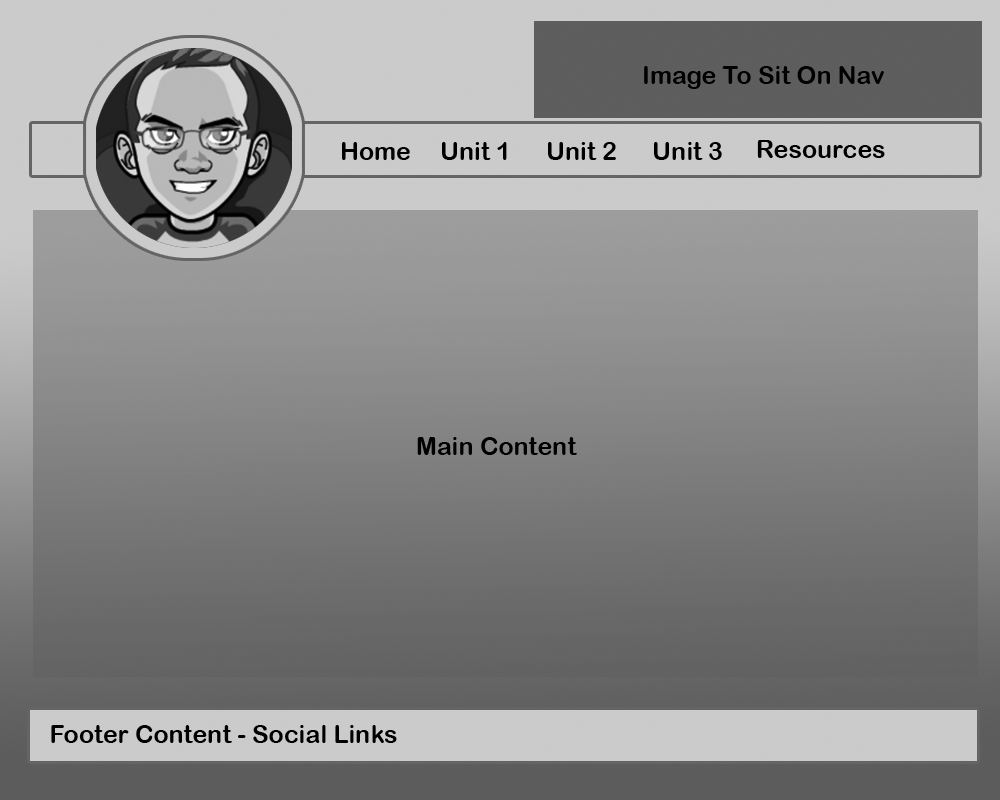
My Index.html - The wireframe
The Problem
The more I use my github.io home page the more I realize it's mostly for linking my challenge work as well as to provide information about myself for my cohort.
If we average 4 linked challenges per week and there are 3 weeks per unit, then there will be 36 links by the end of phase 0. These links need to be organized by unit and then by week to make for quick navigation.
The link names need to be clear and concise so that there is no doubt as to what challenge they reference.
The page should be clean and simple with emphasis on who I am and the work I'm doing.
The Wireframe

The Colors
For the Color Scheme, I decided on the colors below. I've provided the hex codes for each color for reference
The Fonts
All the fonts will be taken from Google fonts. I've provided the links below.
All Headers(h1, h3, etc.) will be the Bangers Font
All links, general text, and paragraphs will be the Verdana Font
